A logo may look perfect on a screen, but that does not always mean it will work well on a hat. Hats have curved surfaces, limited logo space, and different fabric textures. Small design details can change the final result a lot, especially when choosing between embroidery, printing, or patches.
Before placing an order, brands should look closely at the logo itself. The number of colors, line thickness, small text, gradients, and icon shape all affect how clean the finished product will look.
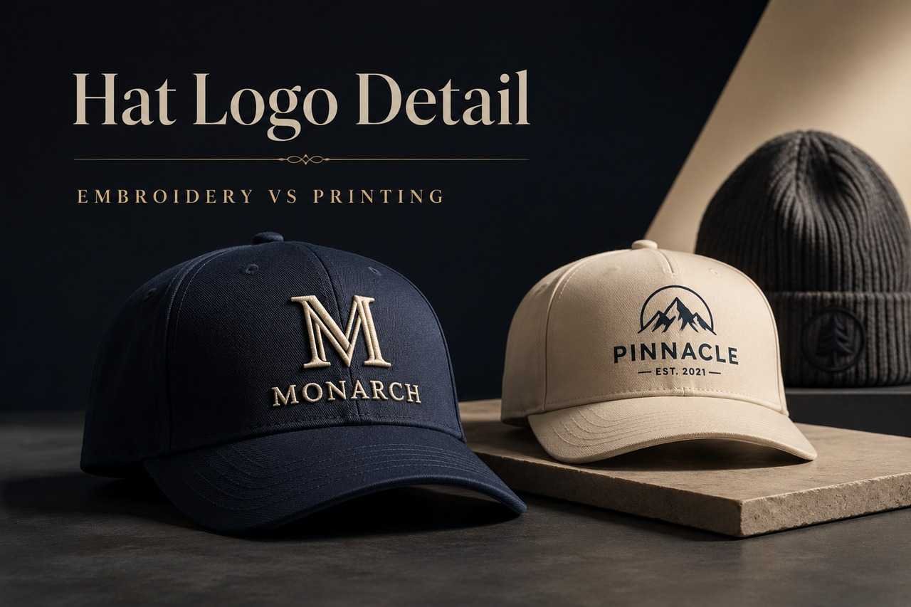
Why Logo Detail Matters on Hats
Hats are not flat like posters or digital banners. The logo usually sits on a front panel, side panel, brim, patch, or cuff area. Each position has limited space, so the artwork needs to stay readable at a small size.
Curved Surfaces Can Distort Fine Lines
A hat front is slightly curved, which means thin lines or long horizontal shapes may not appear exactly the same as they do on a flat screen. Very delicate details can become less visible once they are stitched or printed.
Small Text Can Lose Clarity
Tiny words, slogans, or detailed taglines often cause problems. Embroidery thread has thickness, and printed details may also blur depending on the material. In many cases, it is better to keep the main logo simple and remove unnecessary text.
Embroidery Works Best with Clean Shapes
Embroidery gives hats a raised, textured, and durable finish. It works especially well for bold logos, simple icons, initials, and short words.
For buyers comparing different decoration methods, this guide about custom hat embroidery vs printing explains when embroidery is the better choice and when printing may make more sense.
Thick Lines Are Easier to Stitch
Bold lines usually stitch more clearly than thin outlines. If the logo has small gaps or narrow strokes, they may need to be adjusted before production.
Fewer Colors Can Look Cleaner
Embroidery can support multiple thread colors, but too many colors may make a small logo look crowded. A two-color or three-color version often looks more professional on hats.
Printing Works Better for Colorful Artwork
Printing can be a better option when a logo includes gradients, shadows, detailed illustrations, or larger graphic elements. It creates a flatter finish than embroidery and can hold more visual detail in some cases.
Large Graphics Need the Right Hat Style
Printing usually needs enough flat surface area. Foam-front trucker hats, cotton caps, and some smooth panels may work better than heavy textured fabric.
Material Still Matters
Even with printing, the fabric surface affects the final result. A smooth panel can show sharper detail than a rough or stretchy material.
Beanies Need Extra Design Planning
Knit products are different from structured caps. The surface stretches, the fabric has texture, and the available logo area is often smaller. That is why brands ordering custom beanies with logo should choose artwork that stays clear on knit fabric.
Cuff Areas Are Usually Easier to Brand
The cuff gives a more stable logo area than the crown of the beanie. It works well for embroidery, woven labels, patches, and small logo placements.
Detailed Logos May Need a Patch
If the logo is too detailed for direct embroidery, a patch can help preserve more design detail while still looking clean on the product.
Final Thoughts
A good hat logo is not always the most detailed version of the brand artwork. The best version is the one that stays clear, balanced, and recognizable after production.
Before choosing embroidery or printing, simplify small details, check line thickness, reduce unnecessary text, and match the logo method to the hat material.